overview
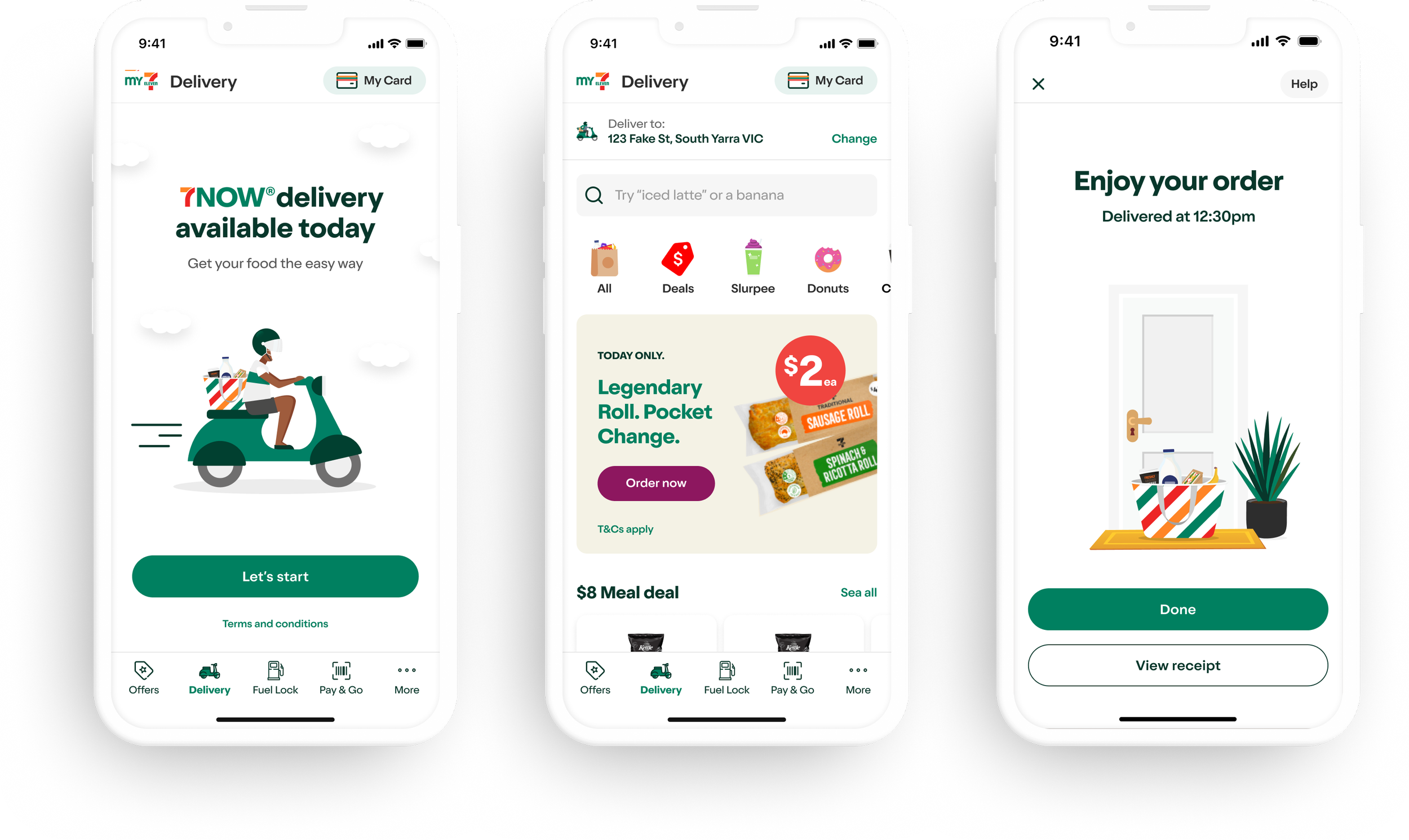
7-Eleven Australia embarked on a major digital growth initiative to reclaim its customer journey from third-party delivery aggregators. This engagement delivered 7Now Delivery as a new feature within the My7-Eleven (MY7E) app, sitting alongside existing services like Fuel Lock and Pay & Go, with a sub 30 minute fulfilment promise built entirely within the owned ecosystem.
I led UI design across the full delivery journey, working closely with UX to shape the commerce experience across a hybrid technical stack (Native iOS + React Native). The goal was a modern interface that prioritises appetite appeal while staying true to 7-Eleven's neighbourhood brand personality.
The approach was pragmatic. Learn from what the leading aggregators have already validated, adapt it to 7-Eleven's position, and design ahead of the technical infrastructure so the product is ready to scale before the platform is. Every decision was made with the next phase in mind.
–
Role: Senior UI designer (Contract)
Core Delivery Team: Product Owner, BA, Senior UX Designer, Senior Service Designer, Engineers & Senior UI Designer (Myself)
Duration: 12 months Tool: Figma, Illustrator
Strategic Context & Customer Insights
The Market Opportunity
The pivot was data-driven. Market research confirmed 7-Eleven was well positioned to compete with the aggregators on its own terms, backed by a differentiator third parties cannot match: exclusive proprietary products. Multi-buy deals, meal deals, and percentage-off category promotions are available only through 7-Eleven's owned channels. Owning the delivery experience meant owning these commercial levers entirely.
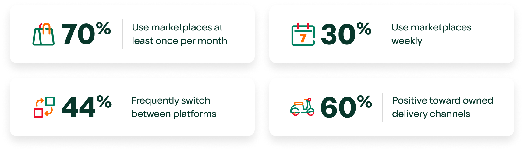
Prior to this project, the MY7E app functioned as a loyalty utility. Most of the user base was driven by the price lock feature rather than loyalty engagement, with no path beyond offers to the full store inventory. That data justified a fundamental shift from discount hunting toward a full catalogue shopping experience.
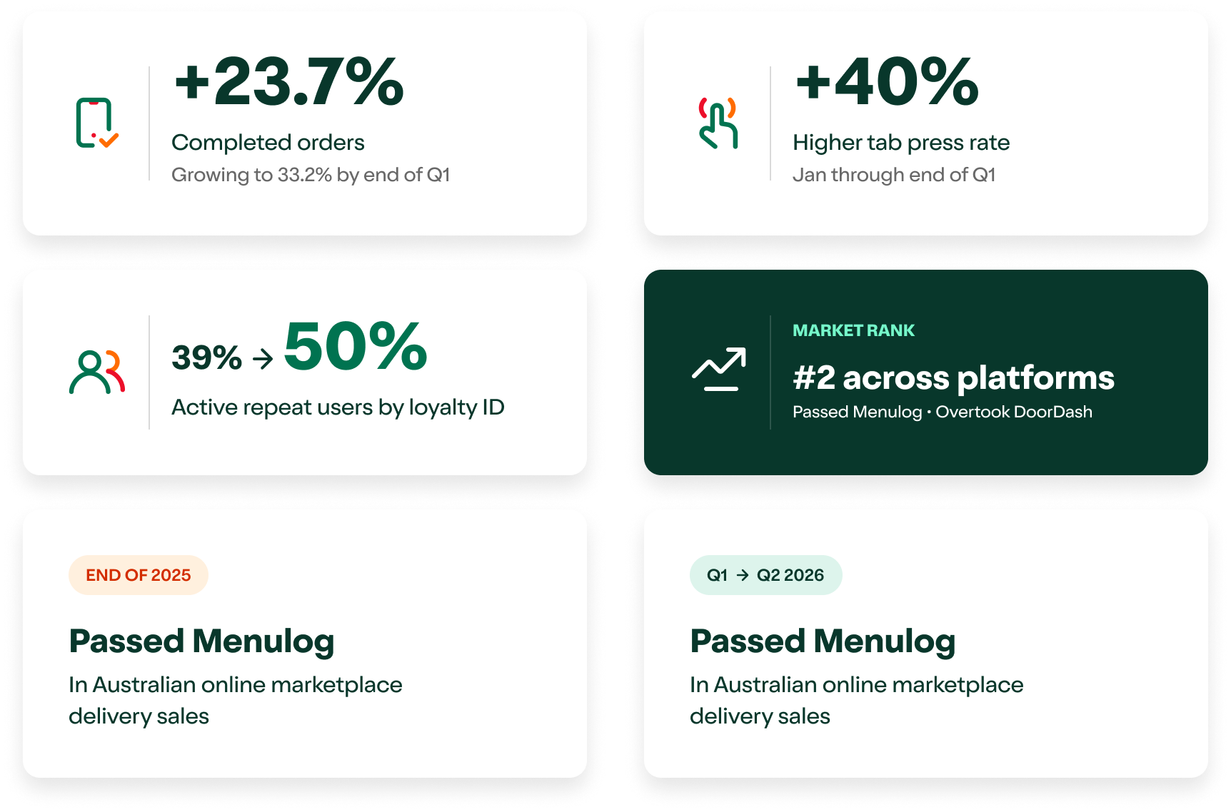
Performance Results
Scope: From hard MVP to Soft Launch
We worked through progressive technical discovery to define a disciplined Hard MVP that could support a controlled Soft Launch, separating what could ship stably from what needed to be deferred without losing sight of the longer term vision.
Navigation Architecture – The Strategic Pivot
A key structural decision mid project was the navigation restructure. When it became clear the delivery journey needed to live in the app's bottom nav, the business decided to rehome the Rewards tab and give that prime real estate to 7Now Delivery. I led the UI response to this pivot and made sure the shift felt intentional and native rather than something retrofitted into the existing app.
As part of the nav overhaul I audited the legacy My Card element and identified a clash with the new modernised design system. It was built as a dated component sitting in a circular container, so I refactored it into a pill shaped component that explicitly aligned with our global CTA geometry. By mirroring the 12px corner radius of our product cards and adopting the pill shape, it created visual stability and immediate tap confidence for the user. One consideration worth noting is that the My Card shortcut currently occupies prime top right real estate across all tabs. For a loyalty first app this made sense and it was always needed, but for a commerce experience like 7Now delivery it does not necessarily need to sit in that position. Future phases should explore IA more broadly and look at how to introduce personalisation, auditing which tabs genuinely need the card shortcut and reclaiming that space for more contextually relevant actions.
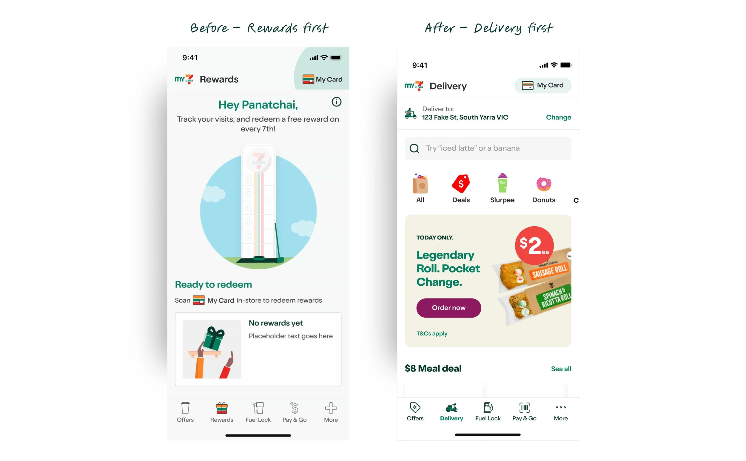
The Rewards tab served a loyalty-first audience, focused on visit tracking, reward redemption, no path to commerce. Replacing it with 7Now Delivery gave the new feature prime real estate in the app's navigation, on par with existing services like Fuel Lock and Pay & Go.

From Draft Mindset to Stress-Tested UI
The UX designer produced the initial top level wires as a brief end to end flow starting from the app opening screen, but once the project kicked off we were told the delivery journey would start from its own tab in the bottom nav rather than the app home. He adjusted the entry point and from there we collaborated on the rest of the ideal state flow together. The ambition covered seamless checkout, transparent pricing, surfaced meal deals and multi buys, savings called out as shoppers added items, live map tracking, personalised recommendations like smart reordering, guest mode for people not ready to commit, and support pulled to the surface rather than buried three levels deep. The goal was speed, clarity and as few taps as possible from landing to order confirmation.
Timelines were tight, so engineering discovery ran alongside design. Engineers scoped their build timelines off the design first wires, and as they worked through SAP, Magento and Tipple discovery, we started getting a clearer picture of what could realistically ship for the soft launch and what could not. Constraints came through progressively. Each time something fell outside the timeline we stripped it from the current scope and I reworked what was left to keep friction as low as we could on the design side.
That became the draft mindset for the whole project. Design led with the full vision, reality shaped what actually shipped, and the features we pulled out did not just vanish. They sit at 80 to 90 percent fidelity in backlog, ready to pick up when the dependencies are resolved. What went live was pressure tested against real constraints, not a diluted version of the original ambition.
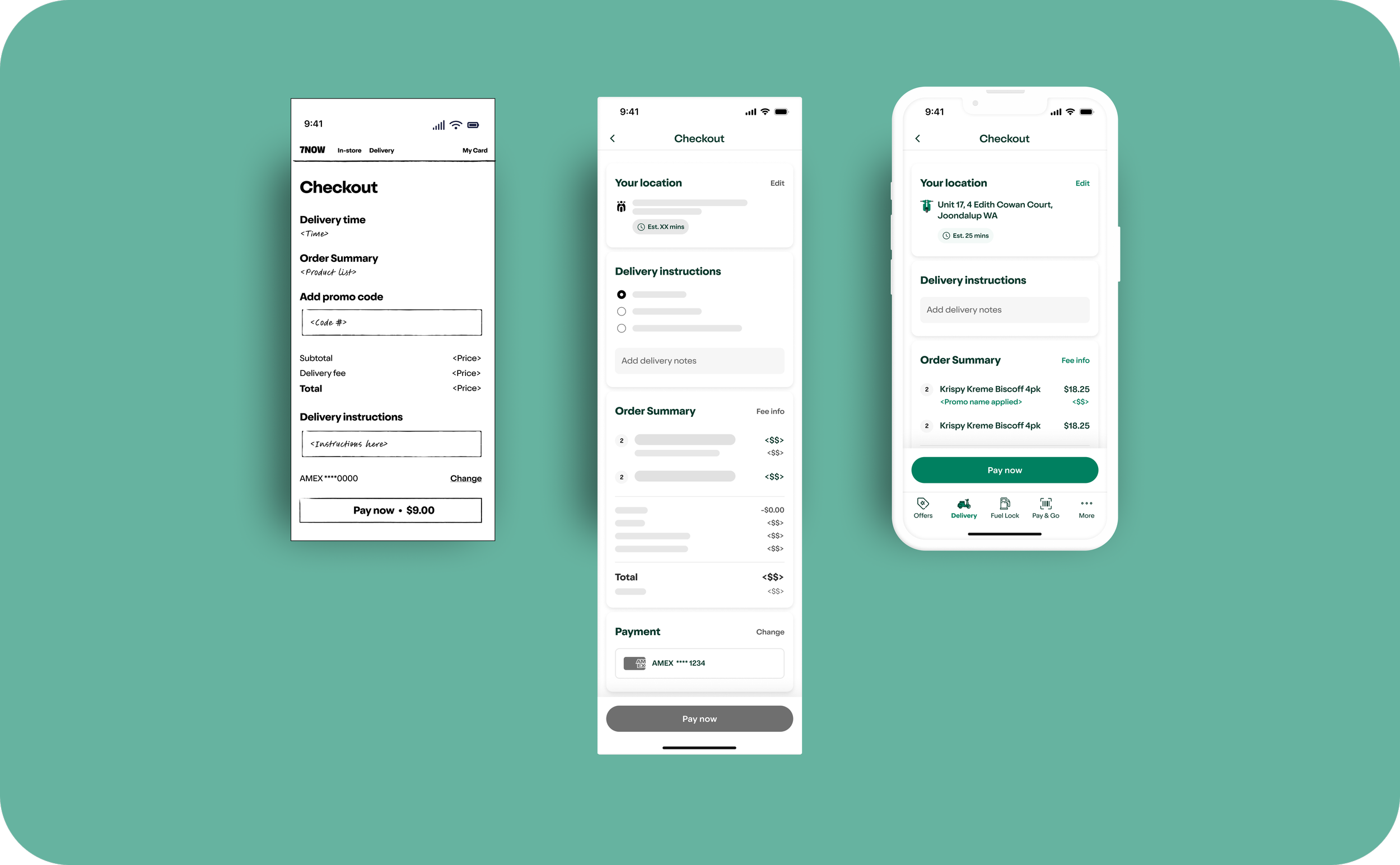
Draft skeletons transformed into high-fidelity interfaces accounting for real-world SAP/Magento data constraints.
What shipped vs what was designed
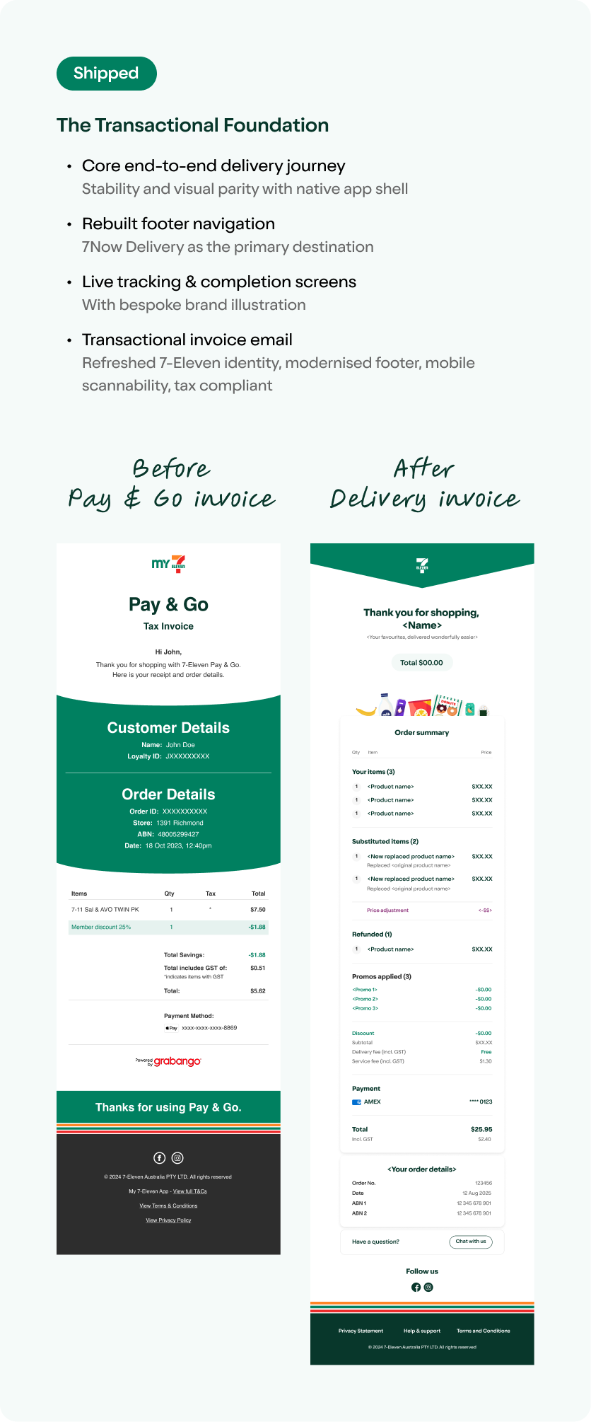
Left. The existing Pay & Go tax invoice, functional but visually dated with the legacy footer. Right. The 7Now transactional email I designed with a refreshed 7-Eleven identity, modernised bottom footer with the brand stripe, and order summary rebuilt for mobile scannability with substitutions, refunds and promos clearly surfaced. Tax compliant and designed to reduce support contacts post purchase.
Visual Governance: Engineering the Neighbourhood UI
Following the Product Owner's directive of "Do not design backwards", I established a scalable UI framework and maintained ownership of high fidelity execution and system integrity. The work moved from foundational environment choices through to refined interaction rules.

The Pure White Canvas & Appetite Appeal
To transition 7Now into a premium commerce experience, I intentionally pivoted the delivery journey to a pure white canvas, departing from the brand's legacy grey ("Ice") backgrounds.
The neutral stage plays on psychological cues of cleanliness and freshness, making food photography appear more vibrant and effectively mitigating gaps in existing asset quality. I audited legacy card components which used rigid grey strokes and fixed containers, and built a new frameless component library to let the products breathe.
The white canvas also opened up a high-impact promotional layer designed for future states. High-contrast badging using vibrant colours that would have clashed with the legacy grey palette, and floating tags with subtle elevation to ensure promotional legibility without obscuring the product hero.
The shift also served as a clear mode switch. A visual distinction between commerce mode and the loyalty mode that preceded it.
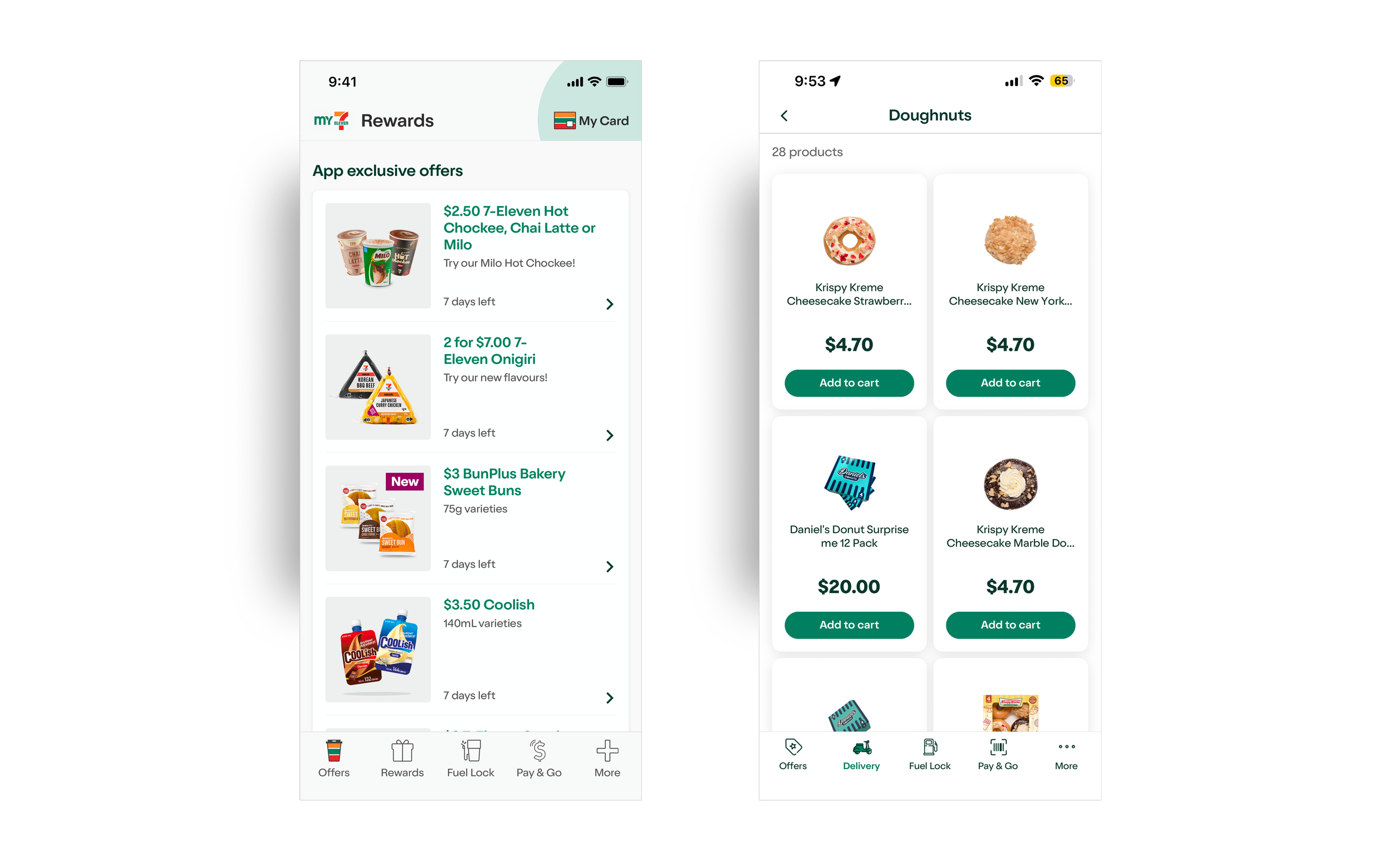
Left: The legacy Offers page with grey image containers, horizontal dead end cards and discount only content. Right: The 7Now Doughnuts category with white canvas, frameless components and full inventory browsing. The legacy Offers page led to dead end offer detail screens with no path to purchase beyond a single discounted item. The white canvas and frameless component library replaced rigid grey strokes with breathing, uncontained products. A clear mode-switch from loyalty utility to commerce platform.
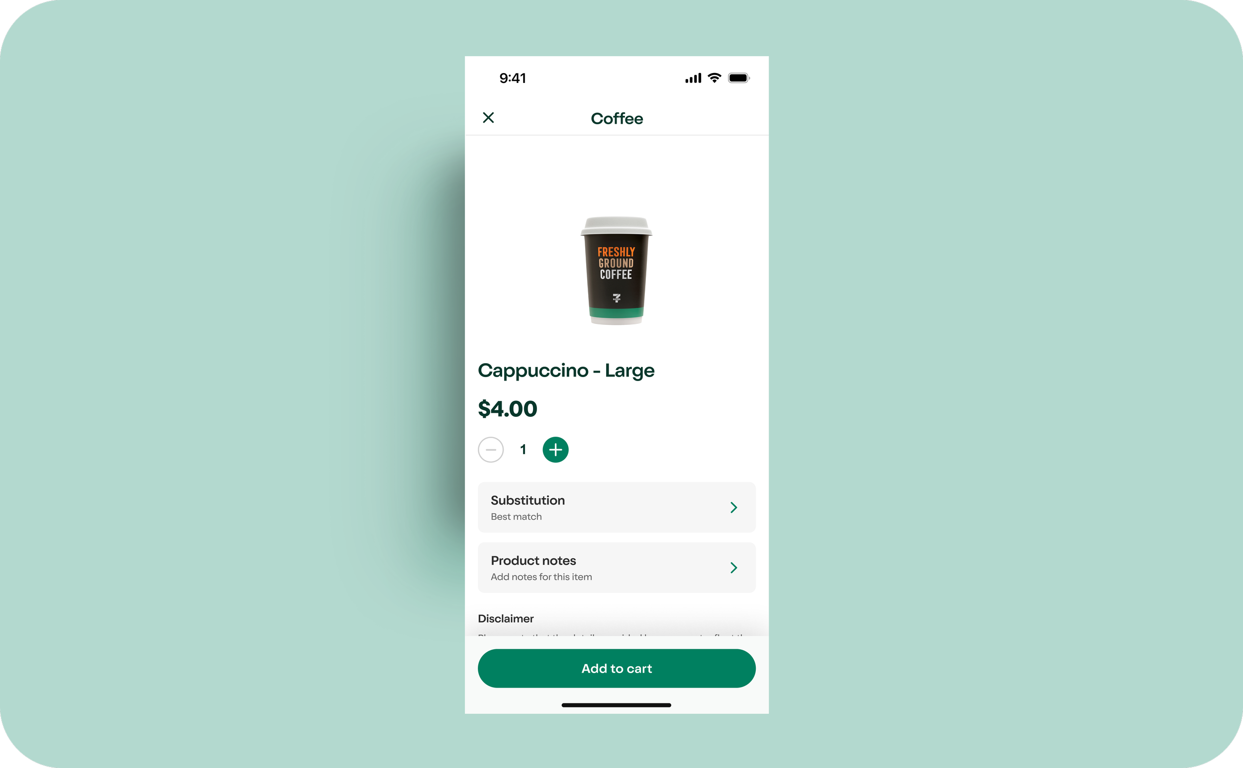
PDP — white canvas in production
All three decisions, one screen
The PDP shows all three visual governance decisions working together in a single screen, white canvas, frameless product presentation, and sentence case CTA ("Add to cart"). The product breathes, the hierarchy is clear, and within the delivery flow, commerce mode is unmistakable.
Asset Strategy & High-Velocity Scanning
Prior to 7Now, the app functioned purely as a loyalty utility. Users were restricted to an Offers page showing only discounted items. The UX designer and I identified the need for a high-velocity entry point to unlock the entire store inventory and reduce user effort.
I introduced category quick links at the top of the delivery homepage and implemented a horizontal scrolling chip system as a deliberate defensive layout decision. A vertical full-stack would have pushed primary commerce content below the fold. The horizontal scroll protected above the fold real estate and maintained visual hierarchy regardless of how many categories existed at any given time.
Tapping a quick link takes the user directly into a filtered product grid, bypassing the category list entirely. "Slurpee" surfaces 18 products immediately, with photography, pricing, and add to cart visible above the fold. No intermediate step, no extra tap.
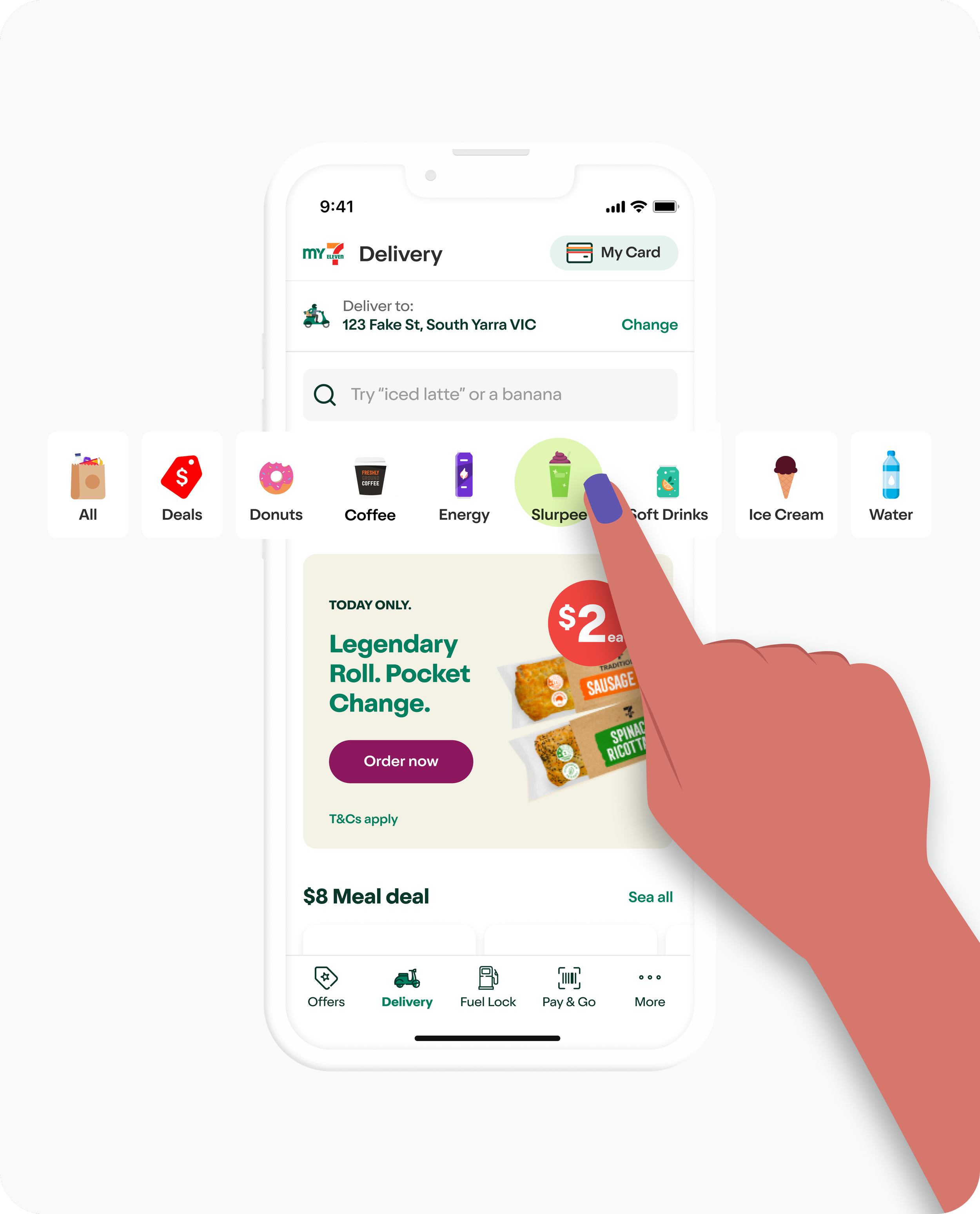
In-situ: horizontal scroll keeps promos and products above the fold
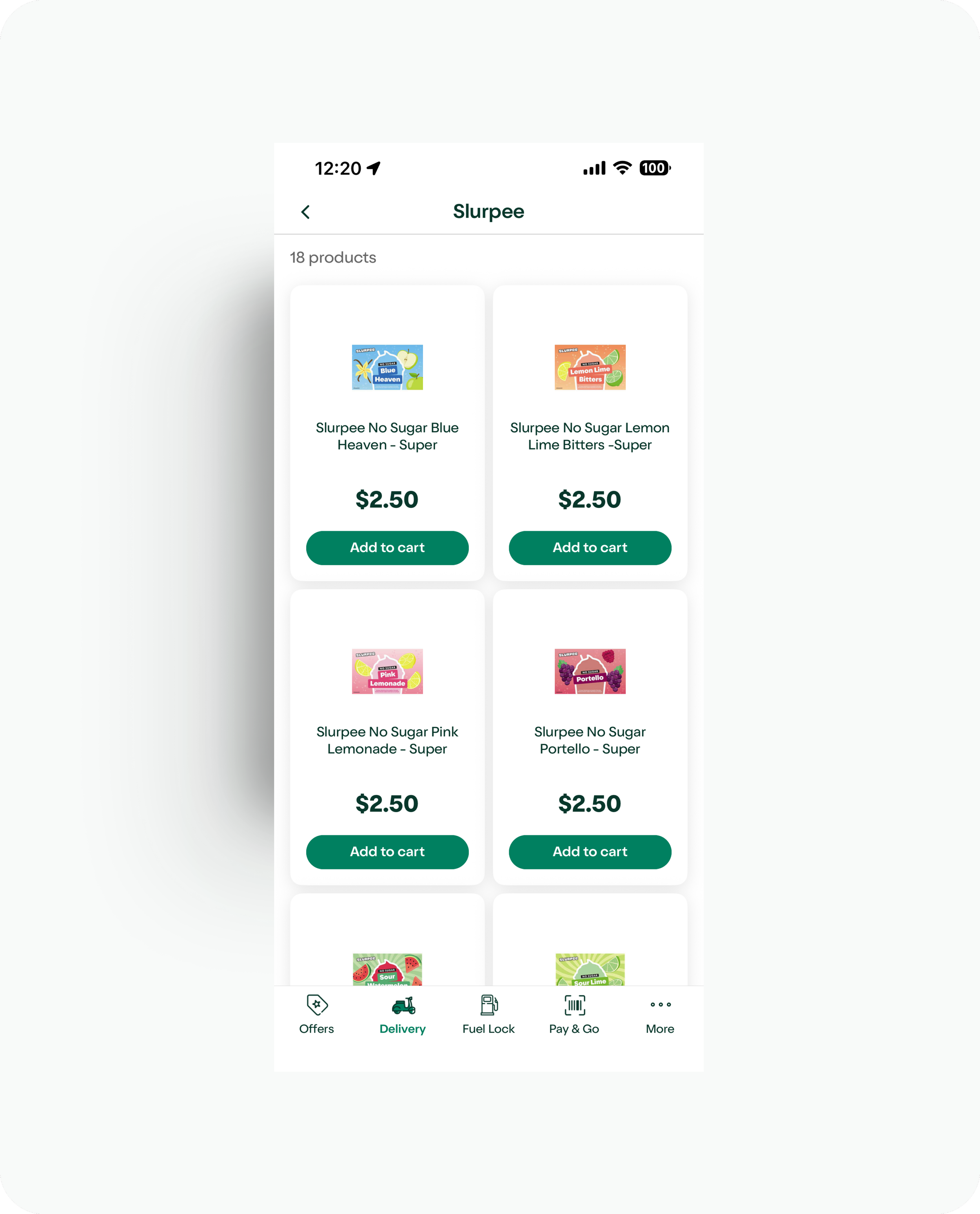
Quick link destination — 18 Slurpee products, directly browsable
The horizontal scroll protects above the fold real estate regardless of category count, with each quick link acting as a direct entry point to a filtered product grid with no intermediate step and no extra tap. "All" opens the full category index while every other chip goes straight to products, and post launch confirmed quick links as one of the most used navigation patterns in the product.
The Case for Illustration
The category quick links on the delivery homepage needed visual identifiers that could work at small scale, update without maintenance overhead, and feel distinctly 7-Eleven. The existing photography was briefed and shot for other contexts, not with small scale UI navigation in mind, so at chip size the packaging detail becomes visual noise and category recognition suffers. Photography also introduces a maintenance problem because every packaging update requires a new asset, which illustration solves entirely.

Left: Product photography at chip scale where packaging detail collapses into visual noise and category recognition suffers. Right: Custom illustration that is generic, immediately readable and consistent regardless of what is on the shelf.
I campaigned for a custom illustrative approach for three reasons. Visual clarity (illustrations provide clean generic representations that bypass the visual noise of specific packaging at any scale), brand warmth (custom illustrations inject neighbourhood personality that static product shots lack), and maintenance efficiency (an evergreen system that remains recognisable regardless of physical packaging updates, significantly reducing long-term design debt).
I also audited the existing app and found a pattern of restricting detailed illustrations to rigid circular frames, which at small scale meant the detail was lost and the brand warmth disappeared entirely. When confined to small circles at navigation scale they end up being neither a legible icon nor an expressive illustration. The correct call at that size is a purposefully simplified icon, and detailed illustration earns its place only when given room, which is exactly what the 7Now delivery flow provides.
I established a variable containment framework. Shaped illustrations for scannable structured interfaces where containment ensures rapid category recognition, and full bleed uncontained illustrations reserved for immersive hero sections to maximise visual depth.
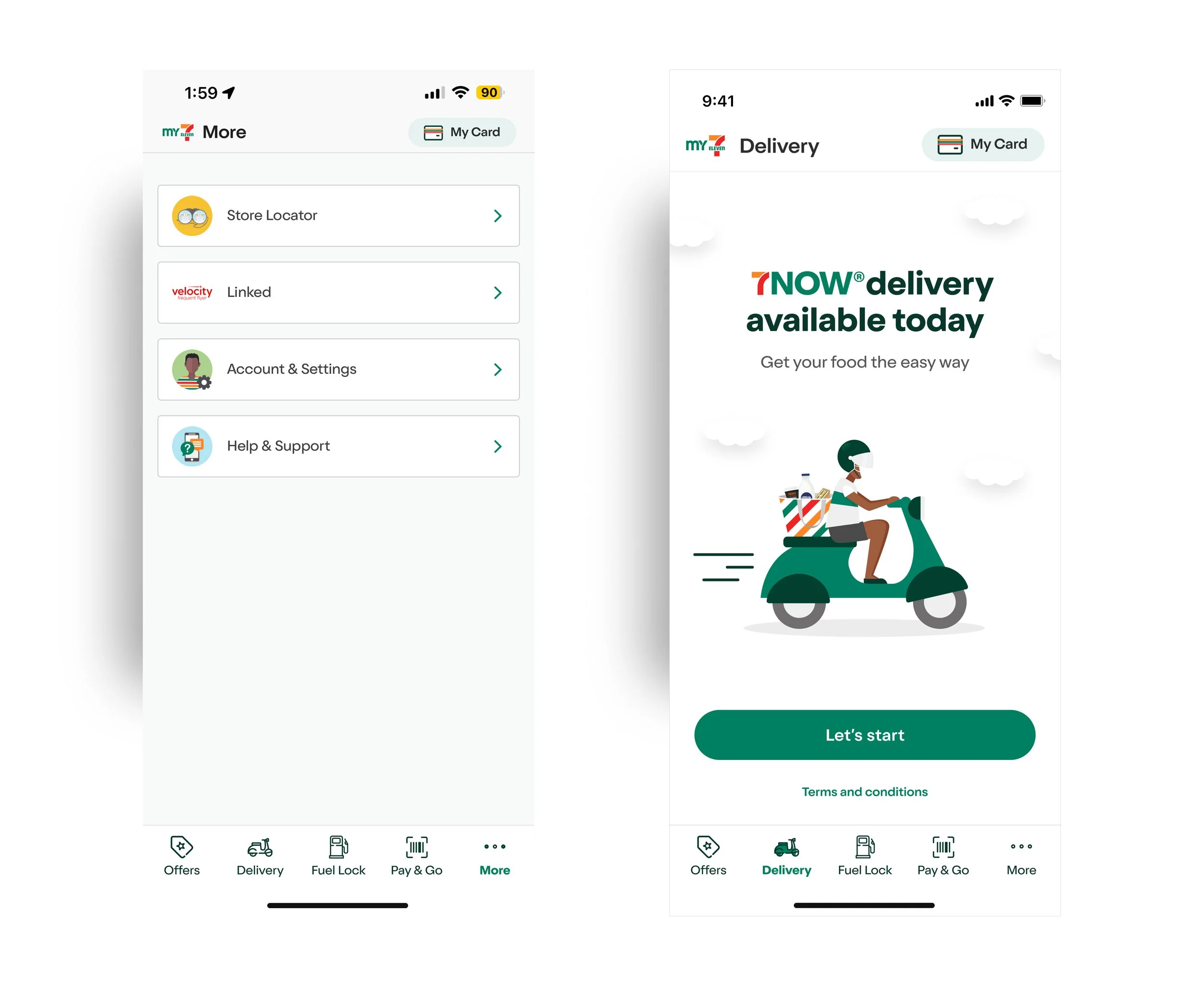
Left: The More tab, active today and one tab away from 7Now, where detailed illustrations are forced into small circles at navigation scale. They are too detailed to read as icons and too constrained to work as illustrations, caught in the middle and neither functional nor expressive. The correct answer at that size is icons. Right: The 7Now splash. The same illustration quality given room to breathe. Full-bleed, uncontained, no circle, no coloured background. The illustration does its job.
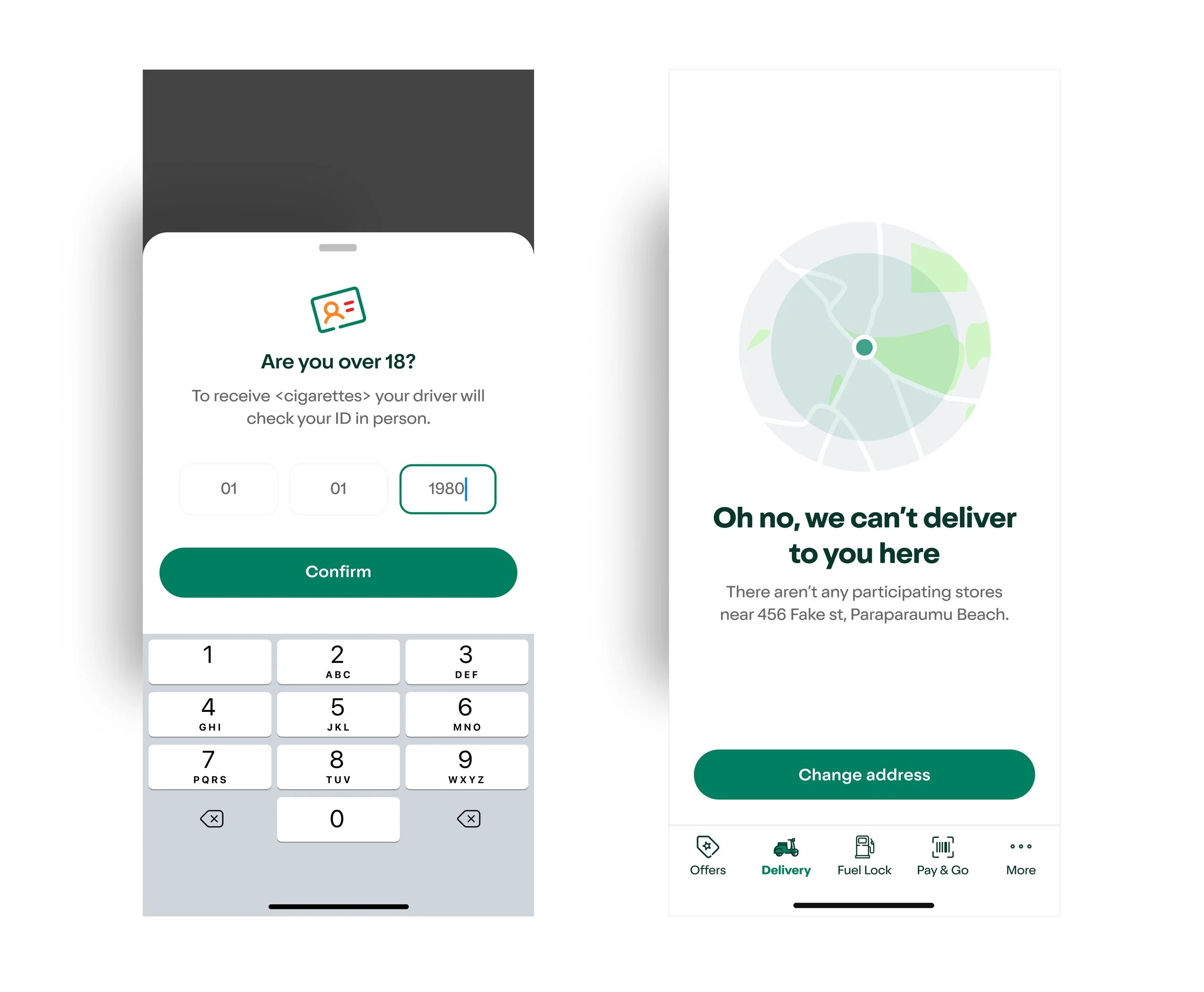
The containment framework in production: Icons at contextual scale, slide-up sheets, error states. Purposefully simplified, legible at small sizes. Illustrations at full-screen scale, given room to carry brand warmth and personality. Size and context determine which system is used.
Brand Personality: The Neighbourhood Aesthetic
While the canvas moved to a modern white, maintaining 7-Eleven's neighbourhood soul was non-negotiable. The typographic foundation was Oldschool Grotesk, suggested by the Australian brand team and approved by the US team, chosen for its high x-height, rounded character, and approachable personality that bridges functional and expressive.
For iconography, the US team sent over a set of icons designed to be simple, easy-to-read, and packed with personality, with the multicolour set in 7-Eleven's three signature colours (orange, green, red) as the preferred direction. I worked with this foundation, made considered tweaks, and created new icons to extend the collection for the Australian context. The rounded corners in the icon set tied naturally to the refreshed illustrations, creating a cohesive visual language across the entire delivery experience.
I built a reusable atomic component library in parallel to keep visual consistency across the Native/React hybrid stack, masking technical complexity behind a unified interface.
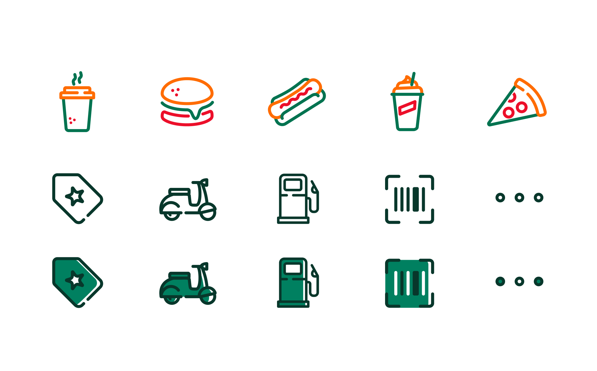

Governance board. Oldschool Grotesk + custom stroke icons. Functional, Fresh, Fun. Digital brand language defined for Native iOS and React environments.
Predictive Validation
To de risk the UI before development, the UX designer and I used Attention Insight ML eye tracking to stress test the worst case card state with all promotional layers active simultaneously. Promo pill, deal badge, strike through pricing and product information all visible at once. The goal was to validate that visual hierarchy held up under maximum complexity before any of that complexity existed in production.
The product card achieved a clarity score of 76 at full promotional load, confirming the hierarchy would direct attention to price and primary CTA regardless of what the backend eventually unlocked. The version that shipped at soft launch was deliberately stripped back. Not because the design was not ready, but because the pricing logic, legal sign off and backend were not.
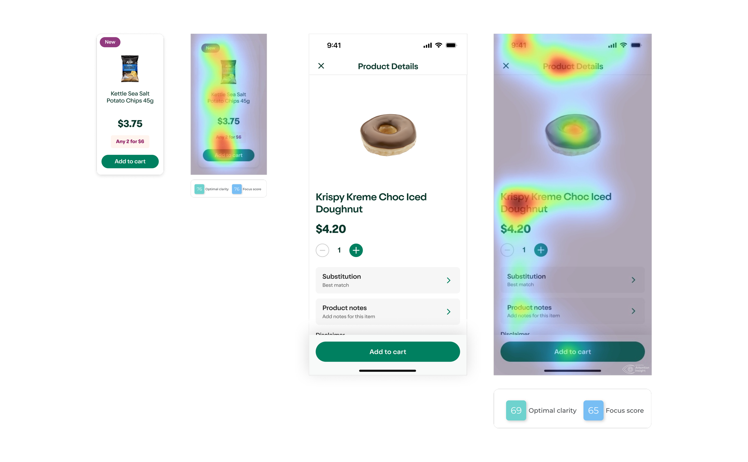
Product card (clarity 76) and PDP (clarity 69, focus 65) both tested under full promotional load. Two scores, two screens. The hierarchy held across the full browse-to-purchase flow.
Interaction Design & Tactical Problem-Solving
Frictionless Live Tracking. Designing for Context
Magento could not support simultaneous active carts. The V1 solve was straightforward. The Delivery tab locks to the Live Tracking screen for the duration of an active order, keeping users oriented. It works, but the ideal state is already designed to roughly 90 percent fidelity and sitting in backlog, ready to build.
The Ideal State. Three Context-Aware Re-entry Patterns
The designed solution recognises how the user returns and matches the UI to their context. Three states working together:
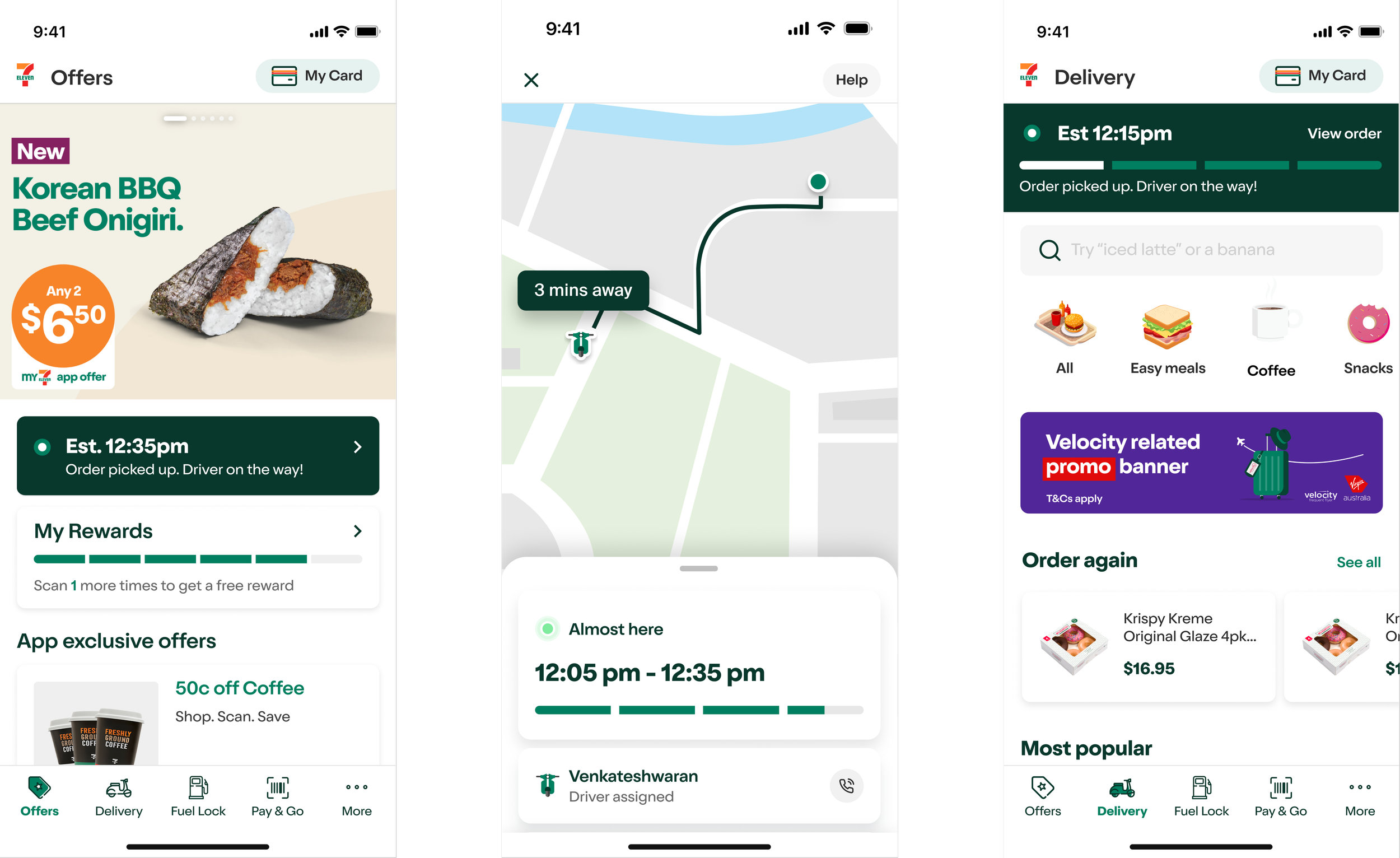
Each surface adapts the tracking module to its context. On the Offers tab during a cold app launch, an inline banner sits below the hero as a secondary reminder within commercial content, because the user may not be thinking about their order. Tapping any banner opens the immersive map tracker where the bottom nav drops away entirely, putting full focus on the driver's location and ETA with a clear exit back. On the Delivery tab where the user has intentionally navigated, a full bleed strip replaces the locked address bar and takes the primary position while the shopping experience flows uninterrupted below. Same data, three hierarchies shaped by what the user is doing and why.
Micro-Animation as Seasoning
I designed a custom loading animation for the 7Now delivery flow, replacing the generic dark splash screen still active across the rest of the app. The animation is not static. It cycles through playful product references while the user waits. "Warming pies and pasties", "Cutting sandwiches", "Your Slurpee is on its way."
The idea was to reduce perceived wait time, reinforce brand voice and keep users engaged through contextual content by injecting brand personality into what would otherwise just be a technical wait state. With more capacity the same approach would have extended to the onboarding splash screen to animate the start of the journey and set the tone for everything that follows, but for now the broader app loading state is backlogged.
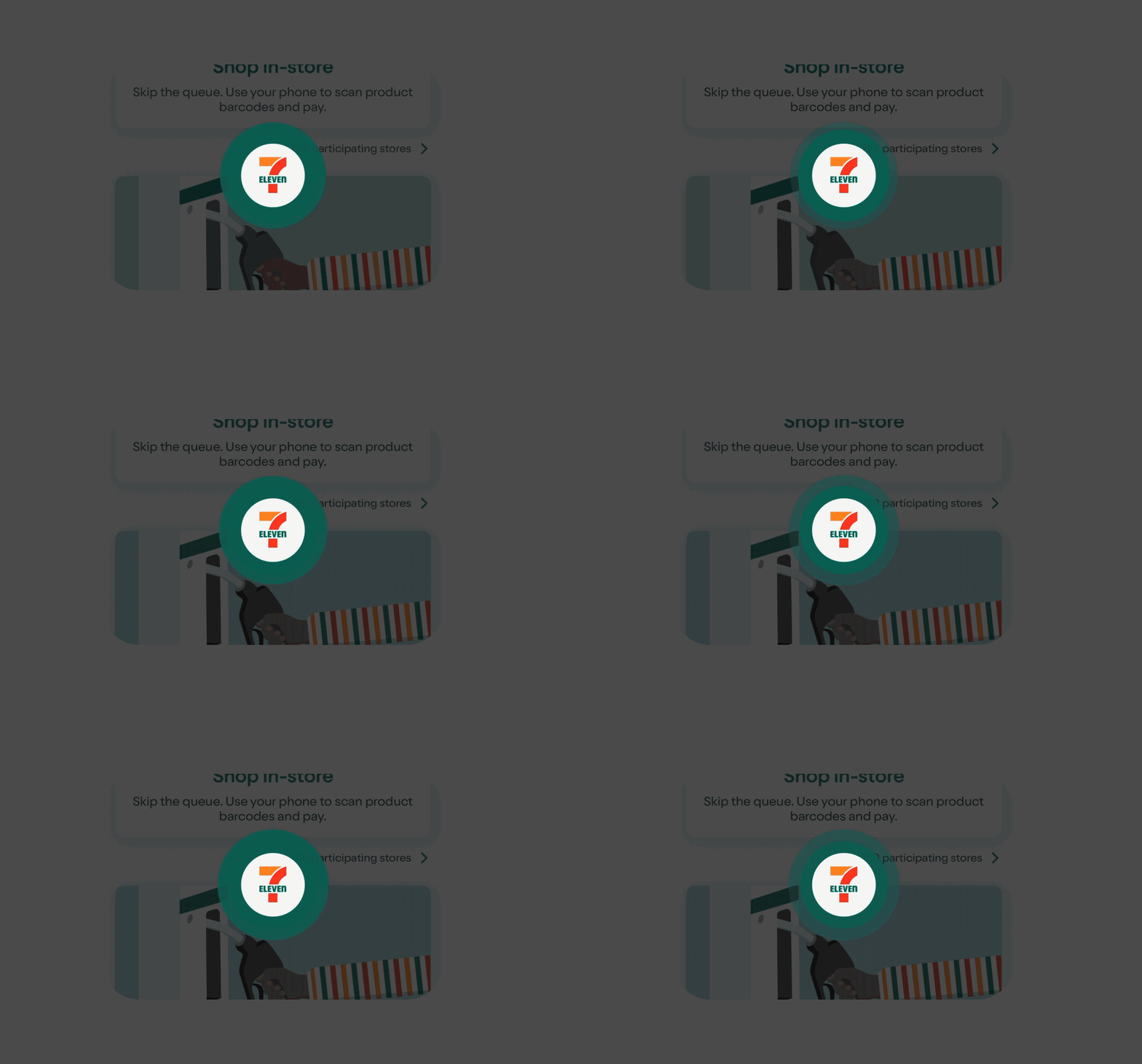
Before - Generic app loading state
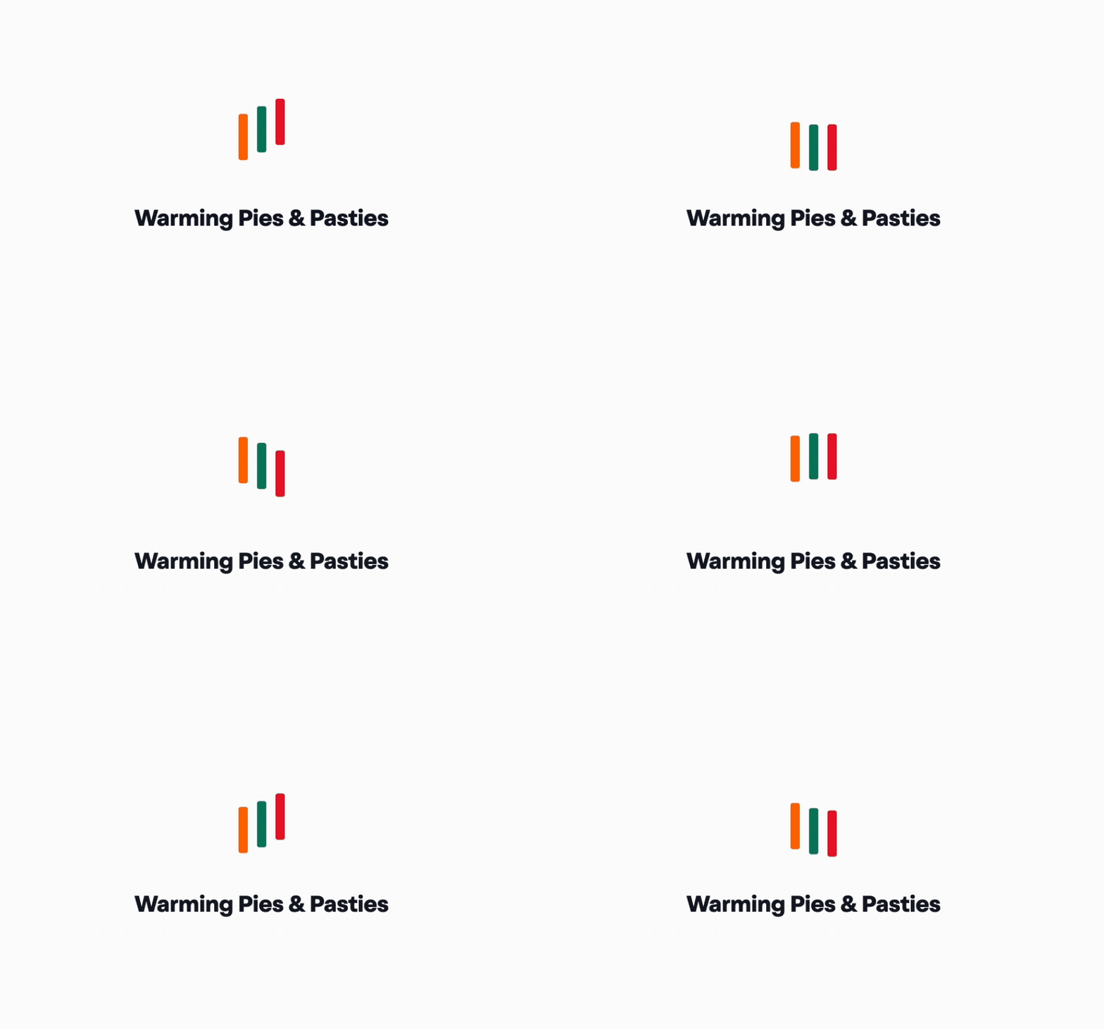
After - 7now custom animation
Left: The generic dark loading state still active across the rest of the app with no brand personality and no engagement. Right: Dynamic brand animation with contextual product copy using three bars in 7-Eleven colours, cycling content that reduces perceived wait time and reinforces brand voice throughout the delivery flow.
Hard Address Entry: A Non-Negotiable Constraint
The mandatory address entry gate was not a design choice. It was the only compliant solution available. Uber's delivery API required a confirmed address before a request could be submitted, and without it the platform had legal exposure around pricing accuracy.
To soften the commitment, we pushed for a guest mode pathway. Not everyone wants to hand over an address straight away, especially first time visitors just browsing. Guest mode lets users explore the experience before committing, reducing drop off at the gate while still satisfying the API and legal requirements at the point of order.
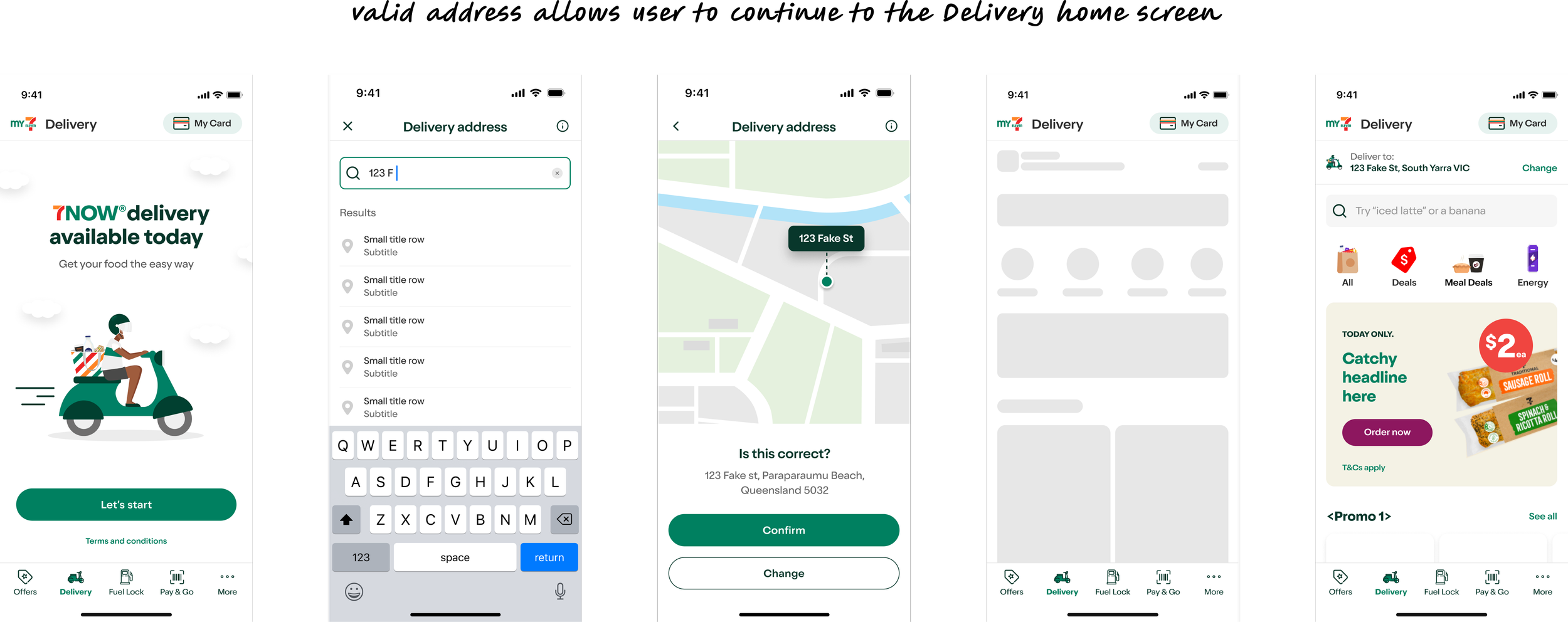
Two non-negotiable drivers. Uber's API could not accept a service request without a confirmed address, and displaying pricing without serviceability confirmation created legal exposure around misleading pricing. The gate was the floor, not a design preference.

The Floating Cart Pill
The app's top navigation was outside the scope of the delivery journey and we had no control over it. With no native cart icon available in the header, users needed a persistent way to see their cart state while browsing. The solution was a sticky floating pill anchored above the bottom nav, displaying item count and running total at all times.
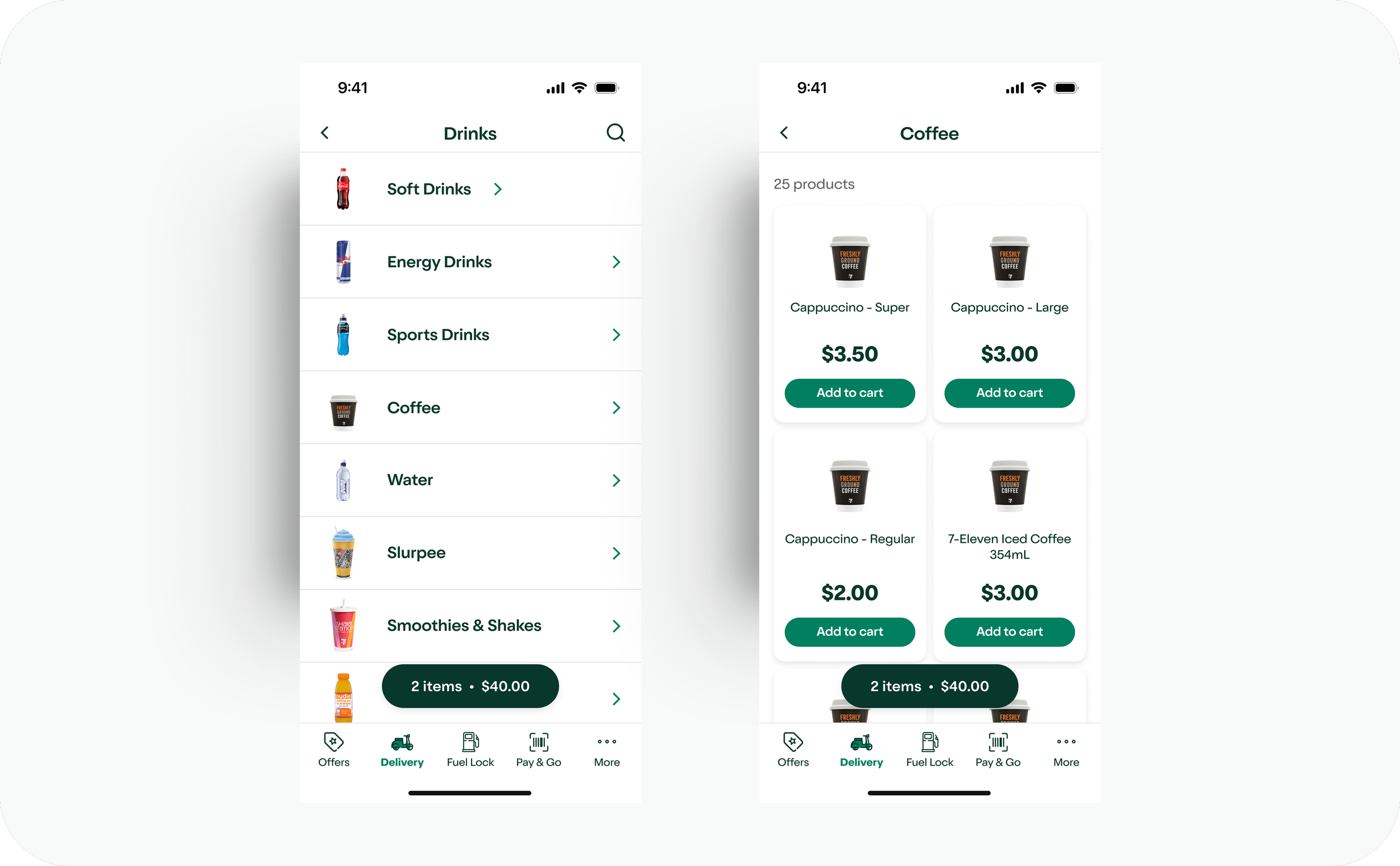
Category list - floating cart pill persistent mid-browse
The floating cart pill anchors above the bottom nav showing item count and running total at all times, with no tap required and no navigation away from the browse flow. It is visible across all delivery screens including category lists, product grids and PDPs so the user always knows what is in their cart without losing their place.
Results & Commercial Impact
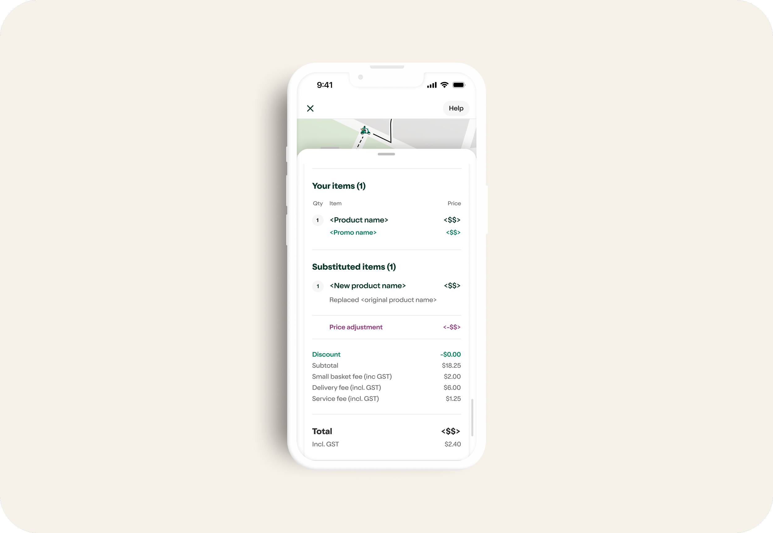
Order management at scale. Real transactions, substitutions and refunds handled in production
The order tracking screen shows the full commerce system in production including driver assignment, substituted items, refunds and itemised pricing. The complexity validates the scope of what was built and quietly illustrates why pricing transparency is the next critical unlock.

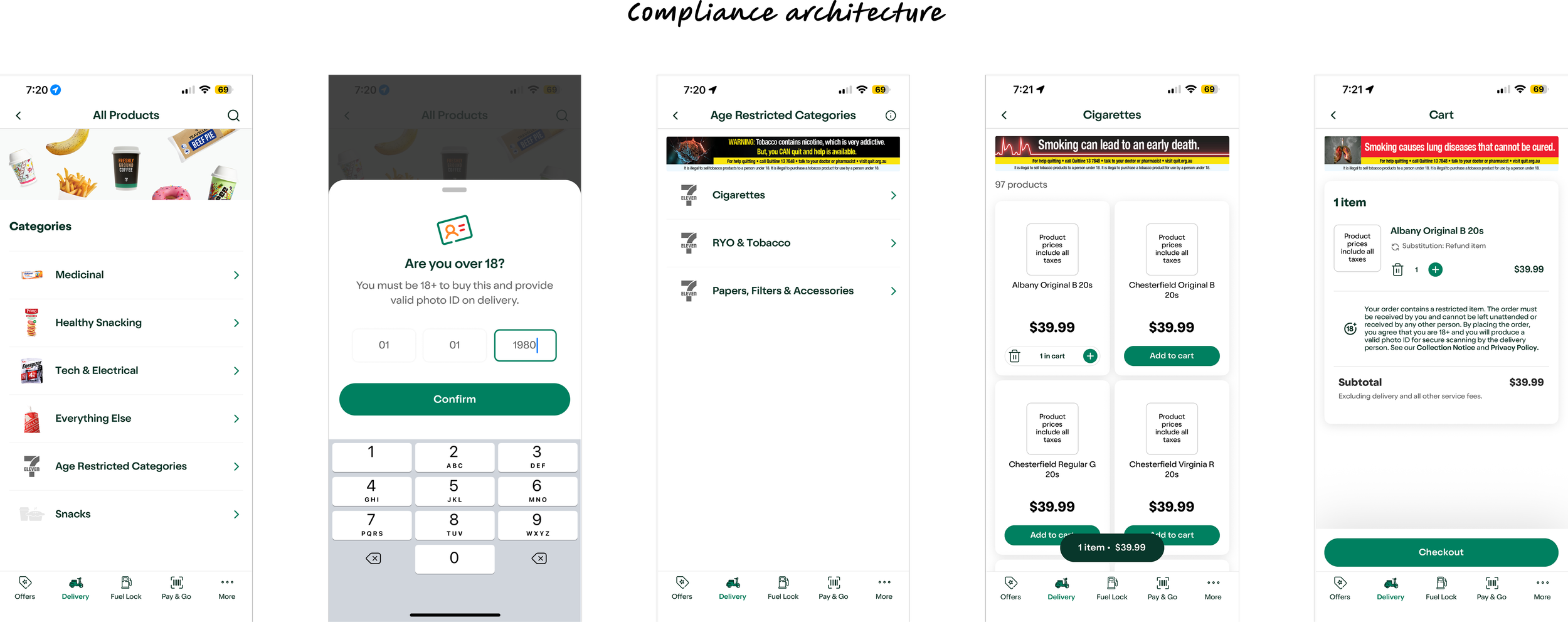
The full age restricted flow covering category discovery, age verification, product grid with health warnings and cart with compliance banner, all designed and shipped without breaking the purchase flow.
Validated by Data: Search-Led Behaviour
At the start of the project the UX designer and I told the team that 7-Eleven shoppers would be search led, going directly to products rather than browsing, and post launch data proved us right. Search engagement was significantly higher than any content or category page, with direct to product navigation as the dominant pattern. Convenience shoppers know what they want, and the data confirmed what good design intuition already told us.
Designed & Ready – Pending Infrastructure
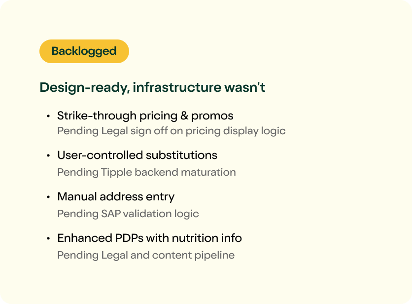
Several features were taken to high-fidelity during the engagement but deferred due to technical constraints, legal sign-off requirements, or backend maturation. This section represents design work that is approximately 80-90% complete. These features have been designed to the best of our ability between the UXer and I with our recommended user experience. However, final completion is pending the maturation of backend systems and further alignment with technical constraints and legal sign-off requirements.
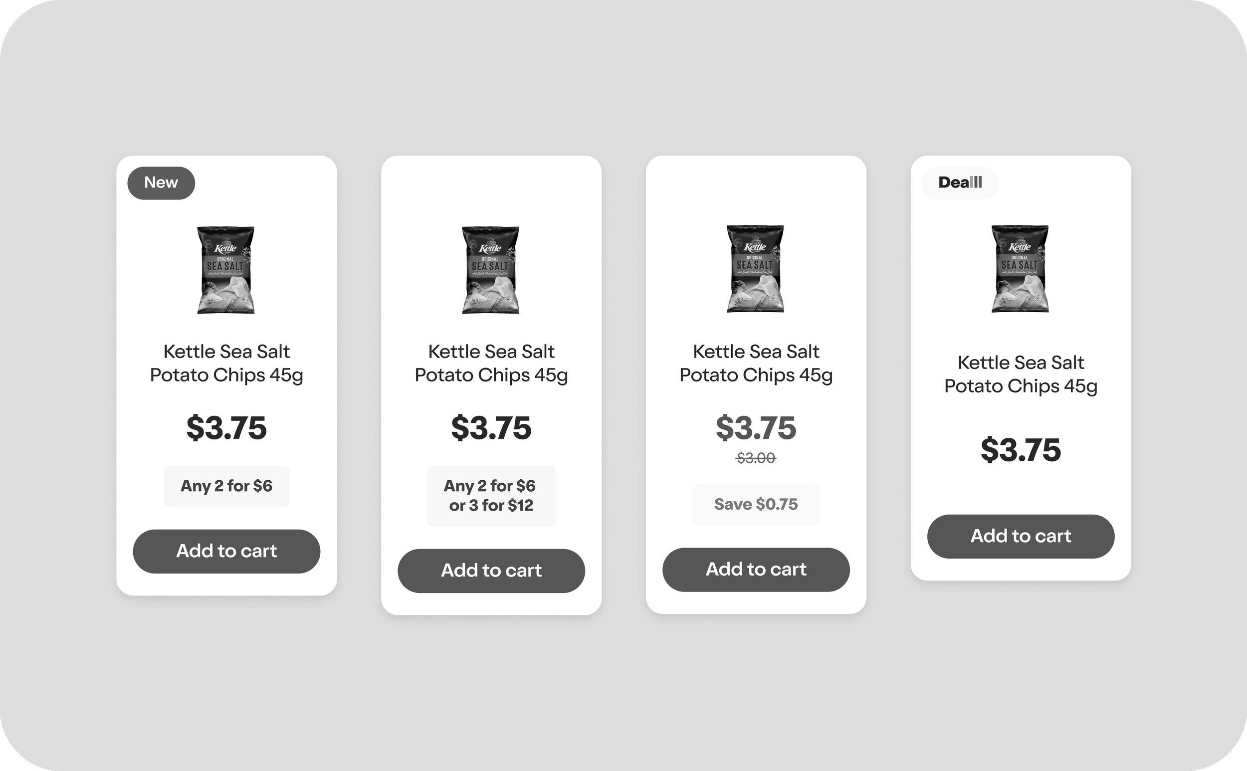
Pricing Transparency
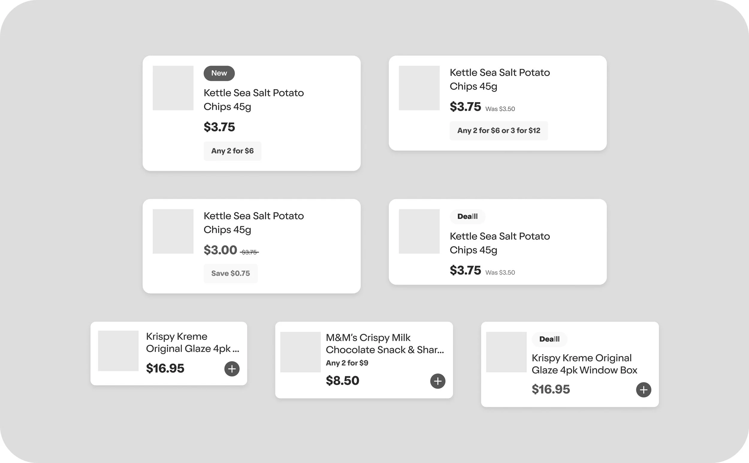
I designed the worst case product card states, all possible content that could need to be displayed simultaneously. New badge, strike through pricing, deal label, save amount. The UX designer and I worked directly with Legal and SAP Engineers to validate the patterns. Legal could not approve them. Without verified MSRP data in the system, there is no legal basis to display a crossed-out price or a save amount. The design is 90% complete. The blocker is a combination of data infrastructure and engineering discovery. Legal also needs to sign off, but engineers still need to figure out the logic or find workarounds for the remaining hurdles. On search, product, and collection pages the displayed price can currently differ from the final order summary price. Resolving this is the highest-leverage unlock available.
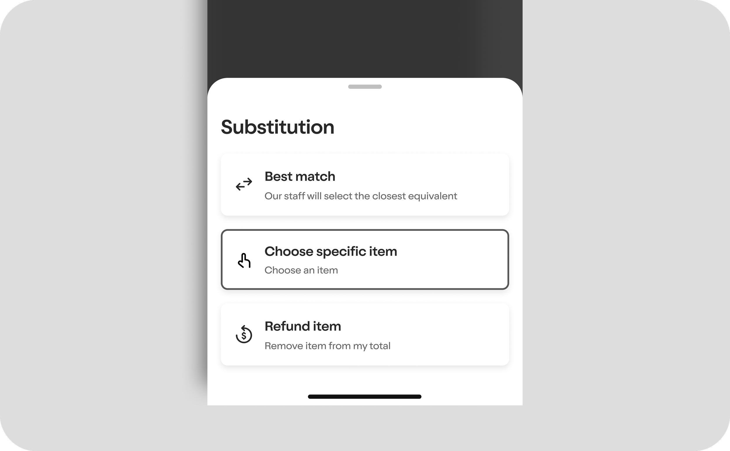
Substitution Preferences – Partially shipped
Three options designed. Best match and Refund are live. Choose specific item was backlogged because engineers could not discover the logic in time. Post launch identified substitution issues as a key churn driver.
Upsell, Cross-Sell & Order Again
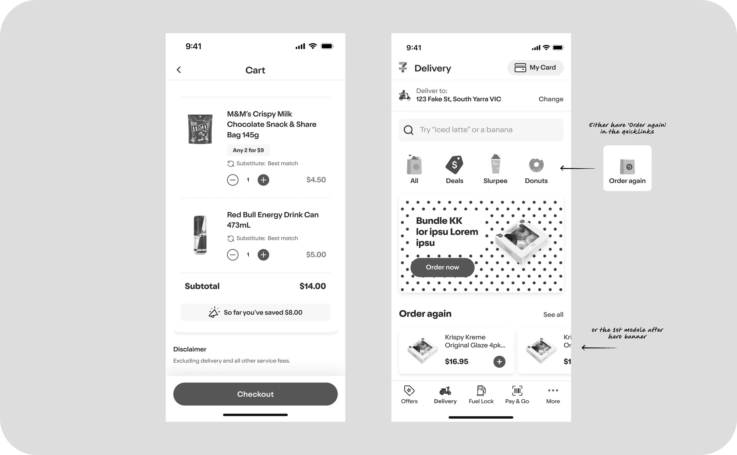
Post launch data confirmed our shoppers are search led. They already know what they want when they open the app and do not really browse. That behaviour validated the need for proactive nudges rather than relying on organic discovery. We mapped out and designed three surfaces: an "Order Again" section on the home screen so repeat purchases are one tap away, an "Also Add" step between cart and checkout surfacing relevant product recommendations, and a "Similar Items" module on the PDP. We also designed a "So far you've saved" callout that shows shoppers how much they've saved in-cart — a deliberate encouragement lever given 7-Eleven is not positioned as the cheapest option. The intent is to reward loyalty and reinforce value. MVP version uses existing product card components. Stretch version uses Rewards tiles or campaign artwork. Design complete, deferred due to backend recommendation logic dependency.
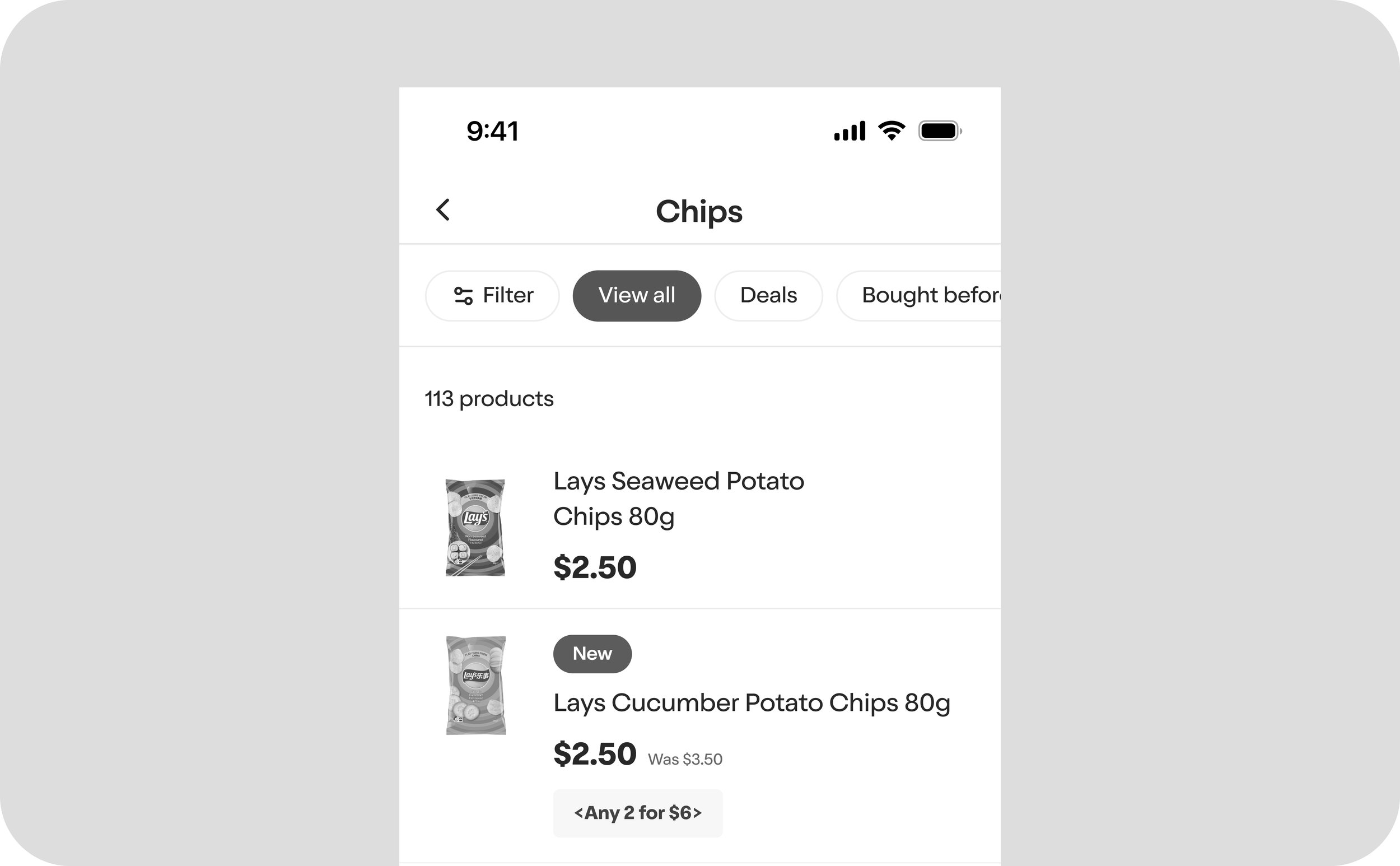
Horizontal Product Cards
A horizontal product card variant sits in the backlog, roughly 80 to 90 percent designed. Master, quick add, deal, out of stock and promo states are all mapped out. It is parked there waiting for the same three dependencies holding back Pricing Transparency to be resolved: pricing logic, promo mechanics and Legal sign off. Once those unlock, this component is ready to drop in. The horizontal format brings more content above the fold and makes repeat purchase flows like Buy Again feel more natural to scan and add.
Filtering & Sort
I suggested filtering and sort controls as a near-term unlock. With the number of products in each category already high and growing, shoppers need a faster way to narrow down and get to exactly what they want. Filter by stock, deals, and category, plus sort options, would meaningfully reduce time to product on deeper category pages. Design is sitting in ideation, ready to be picked up when the roadmap allows.